#reactjs popup
Explore tagged Tumblr posts
Visit Tumblr Blog
Explore Tumblr blogs with no restrictions, modern design and the best experience.
Last Seen Tumblr Blogs


Fun Fact
BuzzFeed published a report claiming that Tumblr was utilized as a distribution channel for Russian agents to influence American voting habits during the 2016 presidential election in Feb 2018.
Text

How to get HTML and CSS code from Figma?
CopyCat scale your web development process and build UI faster. This plugin is easy to install and fully supported to Convert Figma to HTML CSS. Copycat also have a review on their website that says the tool helped save 30% of their development time (only one way to find out), but it’s safe to say that using this tool may eliminate some of the tedious work that makes coding miserable.
#Figma to HTML CSS#Figma to HTML#Figma to React#reactjs-popup edit css#reactjs-popup no trigger#reactjs popup#cdn reactjs#react.js cdn
0 notes
Note
hello! ask game theme makers edition: 11, 13, 16! thankies 💕
11. what’s the most difficult work you’ve done?
I think it's my newest theme, Social Media, because it has more javascript than anything else, haha. It was very complicated because I had to do a lot of calculations so that images with different proportions (landscape and portrait) always fit well in the popup container (last time I do a fixed size container haha), and other tricks using javascript functions that I even knew they exist xD For example posts are "copied and cut" from main view to popup (because I didn't want each post to have its own popup, I'm using the same popup that is always changing) and also adjusting that to infinite scrolling and the NPF posts was very tricky to figure out how to make everything work together XD
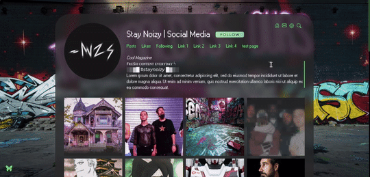
I also want to make an honorable mention to an unreleased theme that I dropped months ago (I want to pick it up again) it was a yugioh card theme, and it's like the same situation with Social Media, posts with different sizes, PopUps, a lot of mess haha.
13. any advice for begginers?
Before anything, learn HTML and CSS (there are a lot of free courses on internet, I recommend w3schools.com), and for CSS is mandatory to learn how positioning and display works, flexbox and grid will save your life, I think this is all you need to make a theme, but if you want to do something a lot more complex, start learning Javascript and then jQuery too. In this last point maybe begginers can get confused, so maybe before starting javascript and if you're really interested in web programming I recommend taking a basic "programming languages "course and learn the basics of general programming, this will resolve a lot of doubts and javascript will be eazy. Also I recommend first learning javascript and then jQuery, the order is important.
Also never give up! in coding don't get upset if you feel that you're not understanding or your code doesn't work or "you're not made for this", I've been there too, just study a lot and practice a lot and you'll find a way to resolve everything :3
16. what do you enjoy coding the most?
In tumblr I enjoy making dynamic pages because I like to think that they're small web applications haha, and in general I enjoy the most coding web applications with cool desings with ReactJS and VueJS n.n
Thanks for asking @phantasyreign! :3
8 notes
·
View notes
Photo

React Popup Component - Modals,Tooltips and Menus ☞ http://bit.ly/2IaRHOl #reactjs #javascript
1 note
·
View note
Photo

React Popup Component - Modals,Tooltips and Menus ☞ http://bit.ly/2IaRHOl #reactjs #javascript
1 note
·
View note
Photo

Lightweight Popup for React Native Apps ☞ http://go.codetrick.net/f1793c064b #reactjs #javascript
1 note
·
View note
Photo

React Popup Component - Modals,Tooltips and Menus ☞ http://bit.ly/2IaRHOl #reactjs #javascript
1 note
·
View note
Photo

Create React Modal using reactjs-popup ☞ http://go.codetrick.net/963c2d9964 #reactjs #javascript
1 note
·
View note
Text
NeonWizard - React JS Questionnaire Multistep Form Wizard React JS
NeonWizard – React JS Questionnaire Multistep Form Wizard React JS
NeonWizard ReactJS built on Bootstrap 4 is a multistep form wizard. It comes with 3 unique styles and its RTL versions. It comes with multicolor options and box version. NeonWizard allows you save your data in a Google spreadsheet and also send you in email. It comes with 5 different “Thank you” page and popup designs for you to choose. Key Features – Easy to compile – Webpack used – 3 Pre style…

View On WordPress
#branch wizard#form wizard#forms#Interview#jThemes#multistep form#questionary#questionnaire#react#reactjs#survey#wizard
0 notes
Photo
React Popup Component - Modals,Tooltips and Menus ☞ https://morioh.com/p/eda19548a690 #reactjs #javascript
#react#react full course#react tutorial#react.js#react tutorial for beginners#reactJS#react crash course#codequs#morioh
0 notes
Text
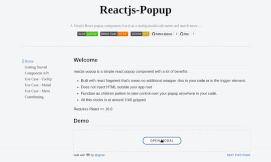
Reasons to Choose Reactjs Popup
Reactjs popup is one such technology that has been gaining in popularity over recent years. Indeed, there are many benefits to this particular library that make it worth your attention. For those who aren’t familiar with it yet, Reactjs popup is an open-source JavaScript library created by Facebook that is used primarily for building user interfaces. It was originally developed as part of a project known as React Native and has been widely adopted by developers due to its efficiency and ease-of-use.
0 notes
Photo

React Popup Component - Modals,Tooltips and Menus ☞ https://morioh.com/p/eda19548a690 #reactjs #javascript
#react#react full course#react tutorial#react.js#react tutorial for beginners#reactJS#react crash course#codequs#morioh
0 notes
Photo

React Popup Component - Modals,Tooltips and Menus ☞ https://morioh.com/p/eda19548a690 #reactjs #javascript
#react#react full course#react tutorial#react.js#react tutorial for beginners#reactJS#react crash course#codequs#morioh
0 notes
Photo

React Popup Component - Modals,Tooltips and Menus ☞ https://morioh.com/p/eda19548a690 #reactjs #javascript
#react#react full course#react tutorial#react.js#react tutorial for beginners#reactJS#react crash course#codequs#morioh
0 notes
Photo

Display a GoogleMap like Android popup to ask for User to Enable Location Services if Disabled ☞ https://bit.ly/2Ur7wpW #reactjs #javascript
0 notes
Photo

React Popup Component - Modals,Tooltips and Menus ☞ https://morioh.com/p/eda19548a690 #reactjs #javascript
#react#react full course#react tutorial#react.js#react tutorial for beginners#reactJS#react crash course#codequs#morioh
0 notes
Text
Hamburger Menu with a Side of React Hooks and Styled Components
We all know what a hamburger menu is, right? When the pattern started making its way into web designs, it was both mocked and applauded for its minimalism that allows main menus to be tucked off screen, particularly on mobile where every pixel of space counts.

CSS-Tricks is all about double the meat.
Love ‘em or hate ‘em, hamburger menus are here and likely will be for some time to come. The problem is how to implement them. Sure, they look simple and straightforward, but they can be anything but. For example, should they be paired with a label? Are they more effective on the left or right side of the screen? How do we tackle closing those menus, whether by click or touch? Should the icon be an SVG, font, Unicode character, or pure CSS? What about a meatless option?
I wanted to build one of those but failed to find a simple solution. Most solutions are based on libraries, like reactjs-popup or react-burger-menu. They are great, but for more complex solutions. What about the core use case of a three-line menu that simply slides a panel out from the side of the screen when it’s clicked, then slides the panel back in when it’s clicked again?
I decided to build my own simple hamburger with sidebar. No pickles, onions or ketchup. Just meat, bun, and a side of menu items.
Are you ready to create it with me?
View on CodePen View on GitHub
Here’s what we’re making
See the Pen Burger menu with React hooks and styled-components by Maks Akymenko (@maximakymenko) on CodePen.
We’re building use React for this tutorial because it seems like a good use case for it: we get a reusable component and a set of hooks we can extend to handle the click functionality.
Spin up a new React project
Let’s spin up a new project using create-react-app, change to that folder directory and add styled-components to style the UI:
npx create-react-app your-project-name cd your-project-name yarn add styled-components
Add basic styles
Open the newly created project in your favorite code editor and start adding basic styles using styled-components. In your src directory, create a file called global.js. It will contain styles for the whole app. You can write your own or just copy what I ended up doing:
// global.js import { createGlobalStyle } from 'styled-components'; export const GlobalStyles = createGlobalStyle` html, body { margin: 0; padding: 0; } *, *::after, *::before { box-sizing: border-box; } body { align-items: center; background: #0D0C1D; color: #EFFFFA; display: flex; font-family: -apple-system, BlinkMacSystemFont, "Segoe UI", Roboto, Helvetica, Arial, sans-serif, "Apple Color Emoji", "Segoe UI Emoji", "Segoe UI Symbol"; height: 100vh; justify-content: center; text-rendering: optimizeLegibility; } `
This is only a part of global styles, the rest of it you can find here.
The CreateGlobalStyle function is generally used for creating global styles that are exposed to the whole app. We’ll import it so we have access to these styles as we go.
The next step is to add a theme file that holds all our variables. Create a theme.js file in the src directory and add following:
// theme.js export const theme = { primaryDark: '#0D0C1D', primaryLight: '#EFFFFA', primaryHover: '#343078', mobile: '576px', }
Add layout, menu and hamburger components 🍔
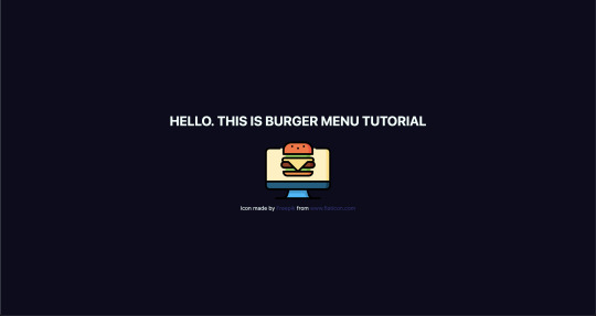
Go to your App.js file. We’re going to wipe everything out of there and create the main template for our app. Here’s what I did. You can certainly create your own.
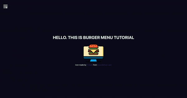
// App.js import React from 'react'; import { ThemeProvider } from 'styled-components'; import { GlobalStyles } from './global'; import { theme } from './theme'; function App() { return ( <ThemeProvider theme={theme}> <> <GlobalStyles /> <div> <h1>Hello. This is burger menu tutorial</h1> <img src="https://image.flaticon.com/icons/svg/2016/2016012.svg" alt="burger icon" /> <small>Icon made by Freepik from www.flaticon.com</small> </div> </> </ThemeProvider> ); } export default App;
Don’t forget to add the line with the small tag. That’s how we credit flaticon.comhttp://flaticon.com) authors for the provided icon.
Here’s what we’ve got up to this point:
Let me explain a little bit. We imported ThemeProvider, which is a wrapper component that uses the Context API behind the scenes to make our theme variables available to the whole component tree.
We also imported our GlobalStyles and passed them as a component to our app, which means that our application now has access to all global styles. As you can see, our GlobalStyles component is inside ThemeProvider which means we can already make some minor changes in it.
Go to global.js and change the background and color properties to use our defined variables. This helps us implement a theme rather than using fixed values that are difficult to change.
// global.js background: ${({ theme }) => theme.primaryDark}; color: ${({ theme }) => theme.primaryLight};
We destructure our theme from props. So, instead of writing props.theme each time, we’re using a bunch of brackets instead. I’ll repeat myself: the theme is available because we’ve wrapped our global styles with ThemeProvider.
Create Burger and Menu components
Create a components folder inside the src directory and add two folders in there: Menu and Burger, plus an index.js file.

index.js will be used for one purpose: allow us to import components from one file, which is very handy, especially when you have a lot of them.
Now let’s create our components. Each folder will contain three files.
What’s up with all the files? You’ll see the benefit of a scalable structure soon enough. It worked well for me in a couple of projects, but here is good advice how to create scalable structure.
Go to the Burger folder and create Burger.js for our layout. Then add Burger.styled.js, which will contain styles, and index.js. which will exporting the file.
// index.js export { default } from './Burger';
Feel free to style burger toggle in a way you want, or just paste these styles:
// Burger.styled.js import styled from 'styled-components'; export const StyledBurger = styled.button` position: absolute; top: 5%; left: 2rem; display: flex; flex-direction: column; justify-content: space-around; width: 2rem; height: 2rem; background: transparent; border: none; cursor: pointer; padding: 0; z-index: 10; &:focus { outline: none; } div { width: 2rem; height: 0.25rem; background: ${({ theme }) => theme.primaryLight}; border-radius: 10px; transition: all 0.3s linear; position: relative; transform-origin: 1px; } `;
The transform-origin property will be needed later to animate the menu it toggles between open and closed states.
After adding the styles, go to Burger.js and add the layout:
// Burger.js import React from 'react'; import { StyledBurger } from './Burger.styled'; const Burger = () => { return ( <StyledBurger> <div /> <div /> <div /> </StyledBurger> ) } export default Burger;
After that look at the left top corner. Do you see it?
Time to do the same with the Menu folder:
// Menu -> index.js export { default } from './Menu'; // Menu.styled.js import styled from 'styled-components'; export const StyledMenu = styled.nav` display: flex; flex-direction: column; justify-content: center; background: ${({ theme }) => theme.primaryLight}; height: 100vh; text-align: left; padding: 2rem; position: absolute; top: 0; left: 0; transition: transform 0.3s ease-in-out; @media (max-width: ${({ theme }) => theme.mobile}) { width: 100%; } a { font-size: 2rem; text-transform: uppercase; padding: 2rem 0; font-weight: bold; letter-spacing: 0.5rem; color: ${({ theme }) => theme.primaryDark}; text-decoration: none; transition: color 0.3s linear; @media (max-width: ${({ theme }) => theme.mobile}) { font-size: 1.5rem; text-align: center; } &:hover { color: ${({ theme }) => theme.primaryHover}; } } `;
Next, let’s add the layout for the menu items that are revealed when clicking on our burger:
// Menu.js import React from 'react'; import { StyledMenu } from './Menu.styled'; const Menu = () => { return ( <StyledMenu> <a href="/"> <span role="img" aria-label="about us">💁🏻♂️</span> About us </a> <a href="/"> <span role="img" aria-label="price">💸</span> Pricing </a> <a href="/"> <span role="img" aria-label="contact">📩</span> Contact </a> </StyledMenu> ) } export default Menu;
We’ve got nice emojis here, and best practice is to make them accessible by wrapping each one in a span and adding a couple of properties: role="img" and aria-label="your label". You can read more about it here.
Time to import our new components into our App.js file:
// App.js import React from 'react'; import { ThemeProvider } from 'styled-components'; import { GlobalStyles } from './global'; import { theme } from './theme'; import { Burger, Menu } from './components'; // ...
Let’s see, what we’ve got:

Take a look at this nice navigation bar! But we’ve got one issue here: it’s opened, and we want it initially to be closed. We only need to add one line to Menu.styled.js fix it:
// Menu.styled.js transform: 'translateX(-100%)';
We are well on our way to calling this burger cooked! But first…
Adding open and close functionality
We want to open the sidebar when clicking the hamburger icon, so let’s get to it. Open App.js and add some state to it. We will use the useState hook for it.
// App.js import React, { useState } from 'react';
After you import it, let’s use it inside the App component.
// App.js const [open, setOpen] = useState(false);
We set the initial state to false, because our menu should be hidden when the application is rendered.
We need both our toggle and sidebar menu to know about the state, so pass it down as a prop to each component. Now your App.js should look something like this:
// App.js import React, { useState } from 'react'; import { ThemeProvider } from 'styled-components'; import { GlobalStyles } from './global'; import { theme } from './theme'; import { Burger, Menu } from './components'; function App() { const [open, setOpen] = useState(false); return ( <ThemeProvider theme={theme}> <> <GlobalStyles /> <div> <h1>Hello. This is burger menu tutorial</h1> <img src="https://media.giphy.com/media/xTiTnwj1LUAw0RAfiU/giphy.gif" alt="animated burger" /> </div> <div> <Burger open={open} setOpen={setOpen} /> <Menu open={open} setOpen={setOpen} /> </div> </> </ThemeProvider> ); } export default App;
Notice that we’re wrapping our components in a div. This will be helpful later when we add functionality that closes the menu when clicking anywhere on the screen.
Handle props in the components
Our Burger and Menu know about the state, so all we need to do is to handle it inside and add styles accordingly. Go to Burger.js and handle the props that were passed down:
// Burger.js import React from 'react'; import { bool, func } from 'prop-types'; import { StyledBurger } from './Burger.styled'; const Burger = ({ open, setOpen }) => { return ( <StyledBurger open={open} onClick={() => setOpen(!open)}> <div /> <div /> <div /> </StyledBurger> ) } Burger.propTypes = { open: bool.isRequired, setOpen: func.isRequired, }; export default Burger;
We destructure the open and setOpen props and pass them to our StyledBurger to add styles for each prop, respectively. Also, we add the onClick handler to call our setOpen function and toggle open prop. At the end of the file, we add type checking, which is considered a best practice for aligning arguments with expected data.
You can check whether it works or not by going to your react-dev-tools. Go to Components tab in your Chrome DevTools and click on Burger tab.

Now, when you click on your Burger component, (don’t mix it up with the tab), you should see, that your open checkbox is changing its state.
Go to Menu.js and do almost the same, although, here we pass only the open prop:
// Menu.js import React from 'react'; import { bool } from 'prop-types'; import { StyledMenu } from './Menu.styled'; const Menu = ({ open }) => { return ( <StyledMenu open={open}> <a href="/"> <span role="img" aria-label="about us">💁🏻♂️</span> About us </a> <a href="/"> <span role="img" aria-label="price">💸</span> Pricing </a> <a href="/"> <span role="img" aria-label="contact">📩</span> Contact </a> </StyledMenu> ) } Menu.propTypes = { open: bool.isRequired, } export default Menu;
Next step is to pass open prop down to our styled component so we could apply the transition. Open Menu.styled.js and add the following to our transform property:
transform: ${({ open }) => open ? 'translateX(0)' : 'translateX(-100%)'};
This is checking if our styled component open prop is true, and if so, it adds translateX(0) to move our navigation back on the screen. You can already test it out locally!

Wait, wait, wait!
Did you notice something wrong when checking things out? Our Burger has the same color as the background color of our Menu, which make them blend together. Let’s change that and also animate the icon a bit to make it more interesting. We’ve got the open prop passed to it, so we can use that to apply the changes.
Open Burger.styled.js and write the following:
// Burger.styled.js import styled from 'styled-components'; export const StyledBurger = styled.button` position: absolute; top: 5%; left: 2rem; display: flex; flex-direction: column; justify-content: space-around; width: 2rem; height: 2rem; background: transparent; border: none; cursor: pointer; padding: 0; z-index: 10; &:focus { outline: none; } div { width: 2rem; height: 0.25rem; background: ${({ theme, open }) => open ? theme.primaryDark : theme.primaryLight}; border-radius: 10px; transition: all 0.3s linear; position: relative; transform-origin: 1px; :first-child { transform: ${({ open }) => open ? 'rotate(45deg)' : 'rotate(0)'}; } :nth-child(2) { opacity: ${({ open }) => open ? '0' : '1'}; transform: ${({ open }) => open ? 'translateX(20px)' : 'translateX(0)'}; } :nth-child(3) { transform: ${({ open }) => open ? 'rotate(-45deg)' : 'rotate(0)'}; } } `;
This is a big chunk of CSS, but it makes the animation magic happen. We check if the open prop is true and change styles accordingly. We rotate, translate, then hide the menu icon’s lines while changing color. Beautiful, isn’t it?

Okay, folks! By now, you should know how to create a simple hamburger icon and menu, that incorporates responsiveness and smooth animation. Congratulations!
But there’s one last thing we ought to account for...
Close the menu by clicking outside of it
This part seems like a small bonus, but it’s a big UX win because it allows the user to close the menu by clicking anywhere else on the page. This helps the user avoid having to re-locate the menu icon and clicking exactly on it.
We’re going to put more React hooks to use to make this happen! Create a file in the src directory, called hooks.js and open it. For this one, we’re gonna turn to the useEffect hook, which was introduced in React 18.
// hooks.js import { useEffect } from 'react';
Before we write the code, let’s think about the logic behind this hook. When we click somewhere on the page, we need to check whether the clicked element is our current element (in our case, that is the Menu component) or if the clicked element contains the current element (for instance, our div that wraps our menu and hamburger icon). If so, we don’t do anything, otherwise, we call a function, that we’ll name handler.
We are going to use ref to check the clicked element, and we will do so every time someone clicks on the page.
// hooks.js import { useEffect } from 'react'; export const useOnClickOutside = (ref, handler) => { useEffect(() => { const listener = event => { if (!ref.current || ref.current.contains(event.target)) { return; } handler(event); }; document.addEventListener('mousedown', listener); return () => { document.removeEventListener('mousedown', listener); }; }, [ref, handler], ); };
Don’t forget to return the function from useEffect. That’s so-called "clean up" and, basically, it stands for removing an event listener when the component unmounts. It is the replacement of componentWillUnmount lifecycle.
Now let’s hook up the hook
We’ve got our hook ready, so it’s time to add it to the app. Go to the App.js file, and import two hooks: the newly created useOnClickOutside and also useRef. We’ll need the latter to get a reference to the element.
// App.js import React, { useState, useRef } from 'react'; import { useOnClickOutside } from './hooks';
To get access these in the current element, we need to get access to the DOM node. That’s where we use useRef, also, the name node perfectly reflects the point of this variable.
From there, we pass the node as a first argument. We’ll pass the function that closes our menu as a second argument.
// App.js const node = useRef(); useOnClickOutside(node, () => setOpen(false));
Lastly, we need to pass our ref to the DOM element. In our case, it will be div, that holds the Burger and Menu components:
// App.js <div ref={node}> <Burger open={open} setOpen={setOpen} /> <Menu open={open} setOpen={setOpen} /> </div>
Your App.js should look similar to this:
// App.js import React, { useState, useRef } from 'react'; import { ThemeProvider } from 'styled-components'; import { useOnClickOutside } from './hooks'; import { GlobalStyles } from './global'; import { theme } from './theme'; import { Burger, Menu } from './components'; function App() { const [open, setOpen] = useState(false); const node = useRef(); useOnClickOutside(node, () => setOpen(false)); return ( <ThemeProvider theme={theme}> <> <GlobalStyles /> <div> <h1>Hello. This is burger menu tutorial</h1> <img src="https://media.giphy.com/media/xTiTnwj1LUAw0RAfiU/giphy.gif" alt="animated burger" /> </div> <div ref={node}> <Burger open={open} setOpen={setOpen} /> <Menu open={open} setOpen={setOpen} /> </div> </> </ThemeProvider> ); } export default App;
Check this out! It works as expected, and it’s fully functional and responsive.
Congratulations, everyone! You did a great job! Happy coding!
View on GitHub
The post Hamburger Menu with a Side of React Hooks and Styled Components appeared first on CSS-Tricks.
Hamburger Menu with a Side of React Hooks and Styled Components published first on https://deskbysnafu.tumblr.com/
0 notes